 Written by Jason Logsdon
How to Analyze a Page with Link Tracking and Scrollmaps
Click to discover how to serve your Fans and grow your incomeOne of the most important things to do when trying to get your readers to do something specific is to track what is working and what is not working. This is true whether you are trying to sell them an ebook, share your recipes on social media, successfully navigate your site, or sign up for your newsletter.
The Tools

There are many tools to do this, and in this article I wanted to look how we analyzed our data by using click tracking and scroll maps. At their most basic level, these tools show you what links your readers actually clicked, and what parts of the page they actually stopped on.
There are many ways to accomplish this. For link tracking, you can use a user-friendly tool like Optimizely or directly use Google Analytics by putting in a link tracker or event tracker.
For heatmaps, CrazyEgg works well, and Mouse Flow, which has a limited free version.
I use these tools for a whole slew of things on Amazing Food Made Easy. They are great for product sales pages but I also use them to help track how effective links in my recipes are, how my right sidebar is functioning, if my newsletter signup links are working and much more.
Why to Use These Tools
There are a few big reasons I use these tools. The first is to see if your links are performing as you want them to. There is no reason to clutter up your site with links if no one is clicking on them.

The second purpose is if you are doing A/B testing to establish a baseline you can test against. This means knowing that currently X% of people click that link, and after the change Y% of people click it. That way you can easily determine if the change was effective.
The third purpose is to identify what content readers are spending time on, and what content they are skipping. This can help you maximize the important content, and tweak content that might not be resonating.
Analyzing Visitor Behavior
Today I wanted to specifically look at the effectiveness of our Sous Vide Timing Ruler sales page. In case it has changed since this article was written, here is the version we are discussing, as well as a quick video look:
I really wanted to see which link drove the most signups. This will help show how much of the page our readers read, especially when combined with heat maps. It will also highlight what content may or may not be the most important to focus on.
Click Tracking
As you can see in the above images, there are a total of 4 "Buy the Ruler" links. We had 5,050 unique visitors and the links were clicked a total of 1,221 times, with the following breakdown.
| Link | Clicks | Percent of Clicks |
|---|---|---|
| 1st Link | 899 | 68% |
| 2nd Link | 211 | 16% |
| 3rd Link | 110 | 8% |
| 4th Link | 99 | 8% |
This shows that 2/3s of the readers used the first link and 84% used a top 2 links and only 16% clicked a bottom link, which is a pretty big discrepancy. Also note that clicks can be double counted occasionally if the same visitor clicks on more than one, which is why the click total is 1,319 instead of 1,221.
Note: You can get more information on using and understanding clicktracking at How to Use Click Tracking in Food Blogging
Scrollmaps
We can now look at the second tool, scrollmaps. Because our website is mobile friendly, it always helps to look at the mobile visitors separately from the desktop visitors.
Note: You can get more information on using and reading scrollmaps at How to Use Scrollmaps in Food Blogging.
Desktop Visitors

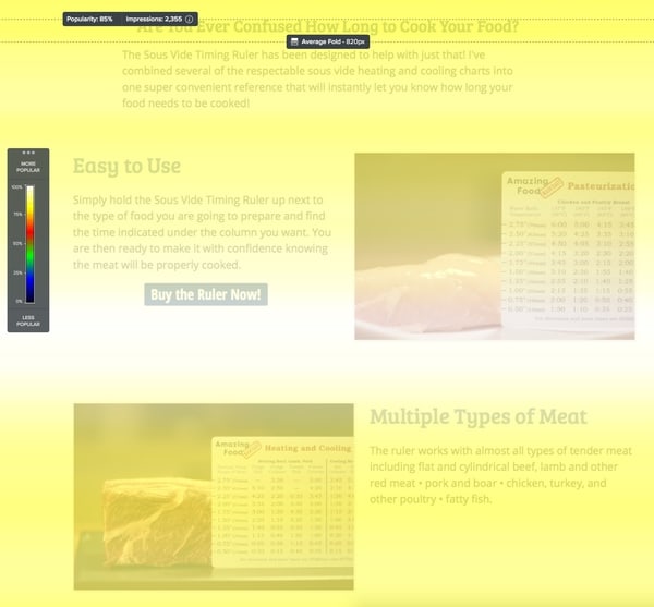
Looking at the desktop visitors, the first takeaway is that most people scrolled right to the middle of the first two sales blocks. This indicates these are the most important blocks and many people either left, bought the ruler, or quickly scanned the rest of the page.

People that were scanning tended to skip directly over the second link and the following sales copy and landed on the time and temperatures displayed.
Most didn't click the following sales link, only 50% even viewed it, but this was another major decision point about whether to buy it or not. Most likely many people left the page at this point and many others scrolled back up and used one of the first "Buy the Ruler" links.

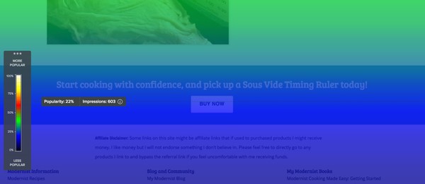
As you can see here, only a quarter of the visitors even made it to the final sales link.
Mobile Visitors
Because the website is responsive, it becomes much, much longer on mobile devices, which changes how users interact with it.
Not surprisingly, mobile visitors didn't make it nearly as far down the page, with only 15% making it to the bottom link (Figure 1).
Mobile visitors did stop on the same beginning sales content, making it apparent that should be our strongest piece of content with almost every visitor to the page stopping on it. (Figure 2)
After scrolling they also stopped on the time and temperatures displayed like the desktop visitors did, making this another pretty important piece of content. (Figure 3)
There was also much more content skipped during scrolling.
Interpreting the Data
Like any complex system, there are lots and lots of ways to interpret the data. I have a few main takeaways from the data that I can try to implement and test out later.
Strengthen the Top Content
With almost everyone pausing on the top content block, ensuring it is as effective as possible is critical. It should convey all the information people really need to make their purchasing decisions.
Make it Scannable
Because so many people skip the content while they are scrolling, making sure the headers are short, clear, and convey the appropriate information is key. They should be understandable and communicate effectively at a glance.
Make "Buy" Links Visible
Trying to ensure that the content sections visitors land on has a visible "Buy" link can help people who have made up their minds instantly move forward with their purchase.
Reorder the Content
It's hard to tell from the limited data if the visitors stop on certain content because it is interesting, or if it is just a natural scrolling point. It can be worth while to move the content around and see how that affects scrolling patterns as well as overall conversion percents.
What takeaways did you see that I missed? Have any follow up questions you need answered? Let me know in the comments!
 Hi, I'm Jason Logsdon! I'm an adventurous home cook and the head writer and photographer for Amazing Food Made Easy. I grew my income to 6-figures by focusing on serving my Fans by providing massive value, and I want to help you do the same.


