 Written by Jason Logsdon
How to Design and Sell a Cheat Sheet Card for a Food Blog
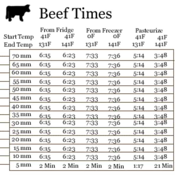
Click to discover how to serve your Fans and grow your incomeOne of the most successful monetization strategies we implemented was to create a plastic "cheat sheet" card that we sold. This can take many forms, but ours was called the "Sous Vide Timing Ruler" and it greatly simplified the process of determining the correct length of time a tender piece of meat needs to be cooked. Here's a shot of it:

Over the first year, we sold about 500 rulers for a profit of $3,000, not bad for a few weeks of work. You can read more about the financial factors in the Physical Produce Case Study: Sous Vide Timing Ruler article.
In today's article I wanted to discuss how to make a similar printed plastic "cheat sheet" card. Starting with picking a subject and going through having it produced, and just touching on marketing it. From here on out, I'll refer to the final printed product as your "card", for simplicity sake.
What is the Card?
Your card can take any form, but the one that worked best for us and we'd recommend starting with, is a plastic printed card. It is thin enough to be flexible and feel "fancy", while being thick enough that it doesn't feel cheap in any way.

Also, because it is plastic it can also get wet, whether that is from food splashing on it, or from being washed with soap and water. We feel this is important because, as we all know, things that are used in the kitchen are always getting splashed on by water, sauces, and food. You don't want your readers to feel as if they have to baby the card.
Since the ruler can get wet, this also means your readers can keep the card out and near their cooking supplies, making it even more handy to access, which is very important.
We went with a 4.125" by 5.5" size, which allowed for a decent amount of information without becoming too large and unwieldy. There are multiple sizes you can use though, going all the way to almost a full sheet of paper. We used a thickness of 18 mil which was thick enough to feel professional without being awkward or cheap feeling.
Determining Your Subject
The most important part of successfully creating and selling a card is picking a subject that will resonate with your readers. There are a few tips I have as you approach this.
Stick With Your Bread and Butter
The best advice I can give you, especially to help with your marketing, is to create a card based around the type of cooking that you always write about. Creating a card for how long to blanch vegetables will be much more successful if you write a popular vegan blog than if you normally write about grilling.
The easiest way to sell these cards is to provide something that your readers will know they want, and eagerly buy, when you promote it.
What Do Your Readers Always Do?
The first area to attack is looking for things your readers always need to do. In our case with sous vide, you always need to determine how long to cook meat for, so our ruler addressed a need our readers constantly had.

Determining the time usually involved the reader trying to determine how thick the food was, logging on to their computer or smartphone (while working with raw meat), pulling up the list of of cooking times they used, finding the thickness of their meat on the list, then finally starting to cook it.
Our ruler changed this process to be: hold the ruler up to the food then cook it for the time indicated. This simplification in process was a huge selling factor.
So you can look at what your readers are constantly doing and get inspiration from that.
It is also very helpful if what your readers are doing requires some kind of exactness. For instance, with our ruler, knowing the exact cooking time is important and readers have trouble remembering "was that an hour and 15 minutes or an hour and 20 minutes". Finding something with exactness will greatly help the card resonate with your readers.
Some examples that might spark ideas in your own area:

- Standard blanching times for different vegetables
- A list of pressure cooker times for various cuts of meat
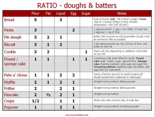
- Standard ratios for cookies, cakes, bread, etc.
- Cooking times for various grains, beans, and legumes
- Gluten free substitution ratios for baking
- Carb counts for common foods
- Standard vegan substitutions for non-vegan items
- Common ratios for mother-sauce bases
- Glycemic Index values for specific foods
- Base ratios for the 50 most common cocktails
Finding a Printer
There are several printers out there but we went with Plastek Cards. We chose a style from their Die Cut Catalog. They have a variety of sizes, their printing is high quality, and their pricing was competitive (500 plastic cards for $380).
Designing the Card
There are three parts to designing the card. The first is to determine the actual information that the card will contain. The second is to lay out the information and mock up the card. The third is to implement the card in a graphic design program for the printer.
While the first step is something any of us can do, steps two and three can become complicated. Based on your skill set you may want to outsource parts of one or both of them.
Determining the Information on Your Card
The first step is to decide what information you actually want to show. For example, if you picked "Carb counts for specific foods" you need to decide:
- Exactly what are the "specific foods" you will show?
- Will you show general carb counts or break it up into types of carbs?
- Is there other carb information that needs to be shown, like suggested daily carb intake?
- Is there other general information that needs to be shown, like your URL, your logo, instructions for use, etc.
Laying Out Your Card

Good card design gets into the field of graphic design, data visualization, and usability. Depending on your comfort level, you may be able to implement this entire step, or it may just entail sketching out a rough outline that you can pass onto a designer.
While good graphic design and data visualization skills are a little outside the scope of this article, keeping a few things in mind can help you still create a good card on your own. And if you are interested in diving deeper a good starting point would probably be Wall Street Journal Guide to Information Graphics, How to Use Graphic Design to Sell Things... or Data Visualization for Business Professionals.
Make it Easy to Read
You purposely picked something that your readers are doing often, so make sure it is easy to read. The fonts should be big enough, the colors bold (even if it is in black), and there should be ample white space so the information is easy to scan. You don't want your readers to struggle reading your card every time they use it.
Don't Cram in Too Much
Something I run into is trying to fit too much information onto the card. At some point, every piece of information you add is making it harder and harder to read.
Pick a Good Card Size
Your card size should be a suitable combination of large enough to hold all the information they need, while still being small enough it can fit seamlessly into their cooking environment.
You will also need the size of the card picked out during this mocking-up phase so you know how much space you have for information.
Test it Out

If you have several design ideas then try them out. This can be anything from using a pen and construction paper to mock it up, to laying them out in Photoshop and printing them onto heavy card stock.
How ever you do it, have it physically in front of you and use it for a week or two to see what works and what doesn't work. It is also smart to send copies to your best friends or top commenters and have them try it and provide honest feedback.
This process will uncover a multitude of issues that you can fix before committing a larger amount of money to printing the physical plastic cards.
Implementing the Design in a Graphic Design Program
Once you have the design mocked up you need to translate it into a graphic design program.
File Format
Most printers only require a PDF or JPG at a 300dpi resolution, which can be done in Photoshop, InDesign, and a host of other graphical design programs. If you are familiar with them the process can be pretty simple.

The printer will almost always be able to provide a template file for one of those programs that you can use to build your design in. They will also let you know the end file format you need.
Once it is built in their template, you can export it in the correct file format and send it to them. They will usually send you an electronic proof back to ensure it looks correct.
Finding Help!
If you aren't familiar with any of those graphic design programs, or graphic design in general, then it can be best to outsource it. The least expensive way is to use a designer through Fiverr, where it will probably run you around $50.
For more customized help, you can look online for local designers, though that will start to run into the hundreds of dollars. You can also ask friends and families if they know anyone who does graphic design, especially if they are younger and looking to add something to their resume.
Selling and Marketing the Cards
We will go into the process of selling and marketing the cards in more detail in a future article, but here is a quick overview.

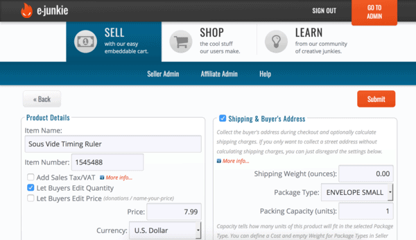
We used E-junkie, in conjunction with PayPal, to collect the payments and store the shipping address of the purchaser. It's an easy system to set up and use, and one we have used for everything from selling ebooks to recurring member payments.
We marketed the ruler both through our general newsletter and through our Exploring Sous Vide email course, both of which use MailChimp (ConvertKit would work as well). We also put up links on many pages that had content related to the ruler.
To ship the cards domestically, we used standard First Class mail ($0.50). The international cost was $1.15 each. The smaller card size we use only requires one stamp, which helped to keep costs down.
So that is what goes into making a cheat sheet card to sell to your readers! Have any follow up questions you need answered? Let me know in the comments.
 Hi, I'm Jason Logsdon! I'm an adventurous home cook and the head writer and photographer for Amazing Food Made Easy. I grew my income to 6-figures by focusing on serving my Fans by providing massive value, and I want to help you do the same.


