 Written by Jason Logsdon
How Can You Use OptinMonster to Drive Traffic to a Specific Page on Your Site?
Click to discover how to serve your Fans and grow your income Click to discover how to serve your Fans and grow your income
A big part of blogging is not just driving traffic to your blog, but also to a specific page on it. There are many ways to drive traffic to a specific page, but one of the most effective we have found is using OptinMonster.
We have used OptinMonster for several different purposes, and we wanted to share how you can use it to drive traffic to a page that you want to highlight with your Fans.
OptinMonster is one of our favorite Tools of the Trade which we have used successfully to both build our email lists and to promote our products.
How Does OptinMonster Drive Traffic
There are several ways to use OptinMonster, but we have found two that have worked really well for us. These two scenarios are described briefly below.
Using OptinMonster for Email Optins
This is the most common use of OptinMonster, where it presents some type of popup on the screen requesting a name and email address. The user typically completes this in order to receive some type of lead magnet such as a PDF, discount offer, or newsletter subscription. In most cases the user contact information will be sent to our email system account such as MailChimp or MailerLite.
We have used this capability of OptinMonster to get email subscribers to our Exploring Sous Vide Email Course and the Amazing Food Made Easy and Makin' Bacon newsletters.
Using OptinMonster to Promote Our Products
We use OptinMonster to promote our own products and services. This typically entails OptinMonster presenting a popup of some type with two options. One takes the user to a sales page for more information, the other closes the popup and assures they will not be shown an optin for that item in the future.
We have run promotions for our free and paid email and video courses, the Makin' Bacon lead magnet, and the gift guide campaigns.
Our Favorite OptinMonster Optins
There are many types of optins available in OptinMonster, but here are a few that we often use and have found to be effective. Two are for desktops and tablets and one is designed for mobile devices.
When an optin is displayed to a reader they can either click on the button and go to the page we are promoting or click on the "No Thanks" text to exit the optin. If they interact with the optin by clicking either of these alternatives, they will not be shown any additional optins from this campaign. Additional information is provided on each type of optin in the sections below.
Mobile Popup Distance Scrolled

The OptinMonster optin for mobile devices is a popup optin which fills the screen with your message as shown in the image at the right, from my iPhone. We designed this popup so that it would be displayed once the user scrolled more than 15% of the way through a page. As mentioned above, it would not be displayed if the user had already interacted with the campaign in some manner.
If you were to scroll the ad up slightly, you would see another phrase under the button in a light gray color that says, "No Thanks, Got It Covered". Since we would prefer them to click on the top button, and go to the gift guide, we make it more visible and easier to activate.
Desktop Floating Bar Bottom Distance Scrolled

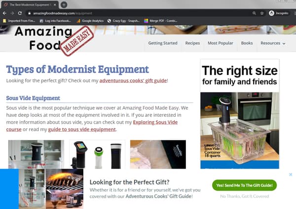
The image above shows how the floating bar ad shows up on one of our equipment pages on a desktop PC. The optin is designed to float up from the bottom of the screen once the user has scrolled through 15% of the page. As mentioned earlier, it would not be displayed if the user had already interacted with the campaign in some manner.
The two images above show how this type of optin works for collecting email addresses. The image on the left shows the initial optin at the bottom of the screen and requests the user to click on one of the two buttons. If they select the top "Yes, Sign Me Up!" button, then the form appears as in the image to the right, allowing them to add their first name and email address. Once they then click the "Sign Me Up!" button their information will be sent to our MailerLite account.
Desktop Exit Intent

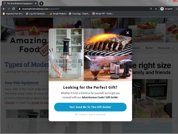
If the reader moves the cursor to the top of the page in order to exit, OptinMonster will darken the screen and display a popup as shown in the image above. We are sure that you have all seen this on other sites, because it is quite effective.
How to Judge the Effectiveness of Your OptinMonster Campaigns

OptinMonster provides a nice analytics suite to help you judge the effectiveness of your campaigns.
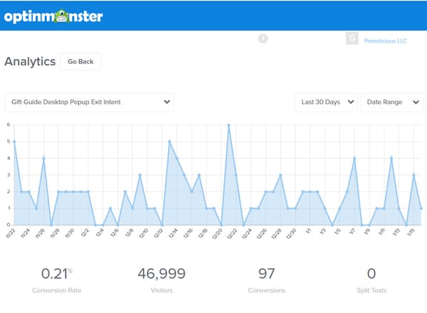
As you can see from the image above, OptinMonster Analytics graphs the number of conversions per day provided by a specific optin. Then under the graph it provides the Conversion Rate, Visitors, and Conversions for the date range specified.
The "Visitors" is the number of times the specific optin was shown to a visitor. "Conversions" indicates the number of times the visitor took the desired action. The "Conversion Rate" simply indicates the percentage of times the visitor converted.
By reviewing these analytics for your different types of optins, you can determine which ones are resonating best with your readers. Moreover, using the A/B testing capability of OptinMonster, makes it extremely easy to accurately test changes in items such as your headline, color choices, button shapes, and optin copy.
How Some of Our Optin Campaigns Have Performed
We wanted to share results from some of our campaigns so you can see what type of performance you can get from using OptinMonster.
Our Holiday Gift Guide Campaign
Like many food bloggers, over the Christmas season we release a holiday gift guide that recommends some of our favorite equipment, books, and tools. This year, we decided to try and drive a lot more traffic to it so we put together a concerted OptinMonster campaign.
Note: You can discover more by reading our series of articles about what we learned from our holiday gift guide marketing campaign.
We showed a total of 242,000 optins to our visitors, which resulted in an additional 733 page views for our holiday gift guide. Here are our results broken down by the type of optin:
| Optin Type | Visitors | Conversions | Conversion Rate |
|---|---|---|---|
| Mobile Popup Distance Scrolled | 102,621 | 518 | 0.5% |
| Desktop Floating Bar Bottom Distance Scrolled | 92,630 | 118 | 0.13% |
| Desktop Exit Intent | 49,999 | 97 | 0.21% |
| Total | 242,250 | 733 | 0.30% |
Our Sous Vide Quick Start Course

Most of the time we are running a campaign to drive optins to our sous vide Quick Start Course. For example, over July and August of 2019 we presented 79,249 optins and drove an additional 284 visitors to our course sales page for a 0.36% conversion rate.
| Optin Type | Visitors | Conversions | Conversion Rate |
|---|---|---|---|
| SVQS Distance Scrolled Mobile | 38,242 | 134 | 0.35% |
| SVQS Exit Intent Desktop | 41,007 | 150 | 0.37% |
| Total | 79,249 | 284 | 0.36% |
Note: You can discover more about how to build your email list by reading our series of articles about how to create courses.
Conclusions
As you can see, using a tool like OptinMonster to drive traffic to specific pages can be an effective method of promoting content and products you want readers to see.
Our experience with OptinMonster has been quite positive and helped us greatly in building our email lists. Moreover, we have found that it's a great tool to help us promote our products and courses. We would encourage you to try OptinMonster to see how it can help you build your list or generate some income.
If you want to read some more about this, here are a few helpful links.
How have you tried to drive traffic to specific page on your site? Let me know in the Makin Bacon Facebook Group or the comments below.
 Hi, I'm Jason Logsdon! I'm an adventurous home cook and the head writer and photographer for Amazing Food Made Easy. I grew my income to 6-figures by focusing on serving my Fans by providing massive value, and I want to help you do the same.


